Few Above-the-Fold Optimization Ideas to Engage Site Visitors
When a person lands on a website, what is the first thing that captures their attention? Is it the impressive images or the unique claims? The success of web design depends on the way you position high-value elements on the page to engage site visitors. This article will explore the idea of “above-the-fold” optimization and eight strategies to engage visitors and encourage them to interact with your content.
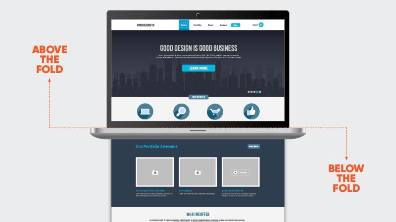
What is the above-the-fold section?
The phrase “above-the-fold” originates from the world of newspaper publishing and sales, where editors used to place eye-catching news items above the fold, hoping to convince the reader to choose their paper over competitors. The term has evolved into the digital age, referring to the area of the website that is visible above the monitor’s scroll line. Research by Nielsen Norman Group shows that people spend 57% of their page-viewing time above the fold, highlighting the importance of this webpage section.
However, it does not mean that your website’s hero section should be a cluttered area filled with attention-seeking elements that bombard web visitors with sales messages. Instead, the above-the-fold design should focus on engaging web visitors, encouraging them to scroll, click, and convert.
A Compelling Value Proposition
People click on links and visit websites, blogs, and landing pages to solve a problem. Therefore, optimizing your value proposition to be fully customer-oriented can draw the target audience’s attention to the benefits of using your solutions/services. By enhancing your Unique Selling Proposition (USP), you can effectively present the real-world benefits of your product and improve conversion rates.
Calls to Action
Placing high-value Calls to Action (CTA) buttons in the above-the-fold section can significantly improve on-page conversion rates, as web users spend most of their time interacting with content in this area. Whether your goal is to generate leads, inspire people to discover your products or services, or simply educate visitors, optimizing CTAs on the hero section of your landing pages is crucial. Understanding your prospects’ position in the sales funnel is essential to deliver better results through upgraded CTAs.
Also Read: How to Optimize Images for Fast-Loading Pages
Breathing Room
Minimalistic web design is popular for a good reason. Research shows that a lower level of visual complexity leads to a better first impression among web visitors. Leaving positive impressions is not the only reason to employ minimalistic web design on your homepage or landing page. Using sufficient negative space:
• delivers a better User Experience (UX) through faster load times
• fosters an easy-to-use, intuitive navigation experience
• comes with fewer bugs
• provides a better chance of making your site responsive
To deliver a great UX and allow web visitors to find elements that inspire them to convert, reduce clutter on your key pages or the entire website. Determine what type of element will grab user attention, whether it’s a stunning image, a compelling USP, a CTA button, or a product video. However, using all these elements might overwhelm your visitors and even prevent leads from converting.
May Like: How to Build a Successful eCommerce Website with WordPress
Simple Navigation
A website with complicated navigation can discourage users from engaging with the content. A simple navigation system with clear labels can improve the User Interface (UI) and provide visitors with a seamless experience. A well-organized menu with dropdown options, categories, or filters can help visitors navigate through the website quickly and easily.
High-Quality Images and Videos
Images and videos are essential for creating a visually appealing website. High-quality images and videos can attract users and engage them with the content. However, using too many high-resolution images or videos can slow down the website, leading to poor UX. To optimize the site’s performance, consider compressing images and videos
Image Source: www.convertcart.com


